COVID-19
This is a data analysis report concerning the visualisation of the COVID-19 virus within the Republic of Serbia. All of the report is created with R.
This is a Sister Analyst project.
Open data belongs to everyone; it empowers people to make informed decisions that are not clouded by misinformation, rumour and gossip. To be able to identify the underlying facts within data sets it’s crucial that individuals and communities possess the necessary skills. In other words, people should be data literate i.e. as comfortable studying models and charts as they are reading a newspaper.
One of our fundamental objectives is to reveal the power of data, we do this by teaching people how to make sense of seemingly inaccessible data formats. We believe this is a necessary step to making data a democratic resource. Why? Because the more we make decisions based on facts and science the less susceptible we are as individuals, communities and nations to untruths.
At present we are attempting to map the progress of the Covid19 virus in Serbia. Serbia lags behind many countries in how it collects, processes and makes data available. The available data is often inconsistent and limited and requires a significant amount of time to organise and structure for presentation.
Up until March 29th the Office for Information technologies and eGovernment of Serbia provided the basic data relating to the regional spread of the virus, now they have apparently ended the publication of the data. Correspondingly the nation is warned not to spread misinformation, with punitive measures put in place to enforce this edict. The irony of this situation isn’t lost on us, on one hand we are told not to spread misinformation whilst simultaneously reducing the amount of factual information available to the population.
We will continue to source any available data related to Covid19 in Serbia and update our site accordingly using data published by European Centre for Disease Prevention and Control .
Using ecdc data
ecdc data updated on 2020-05-06.
Daily numbers of new and death cases
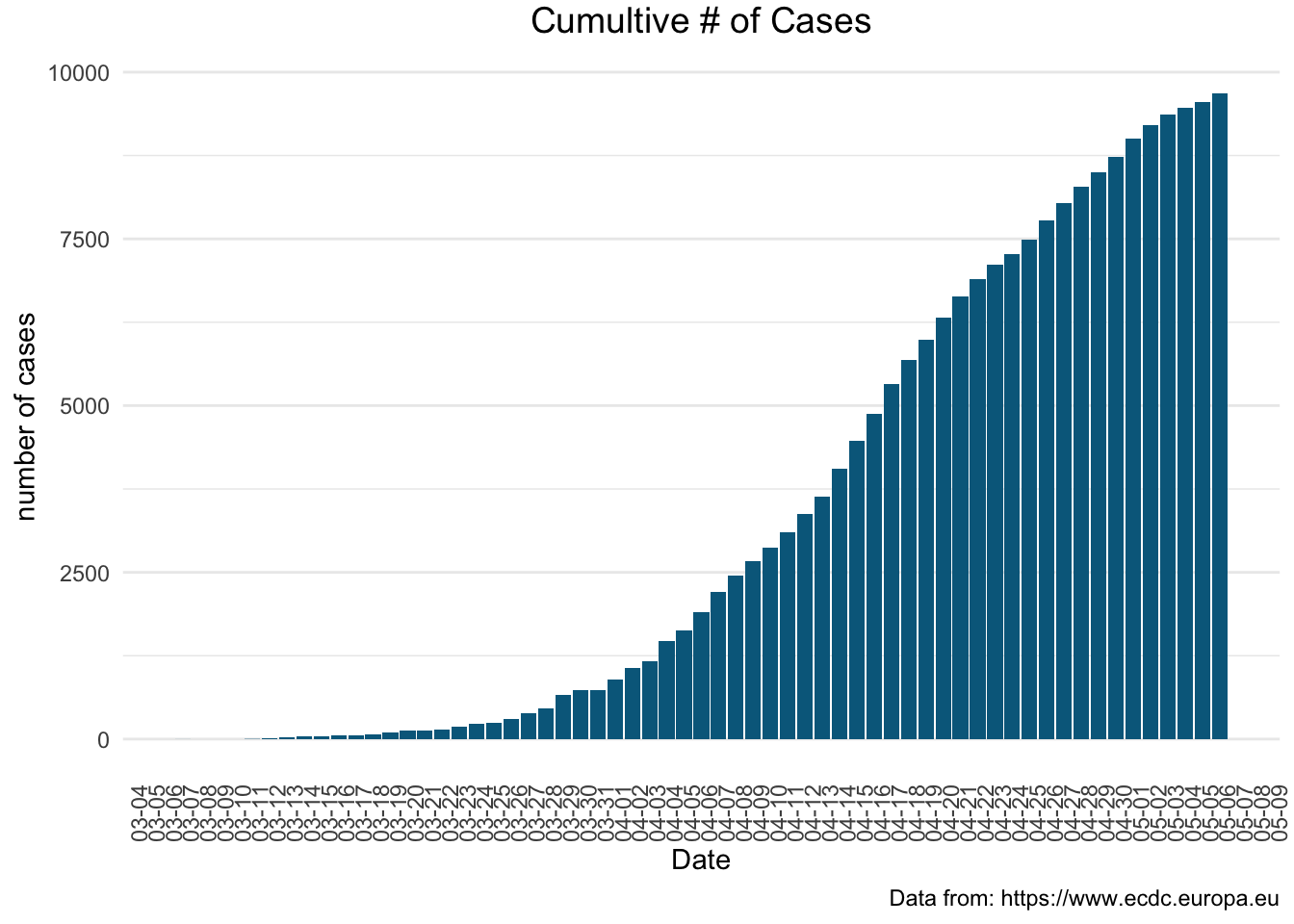
Number of total confirmed cases
The experience with COVID-19 shows that infection of the disease can be controlled by implementing the measures of prevention as soon as an outbreak has been detected.
To monitor the effectives of the introduced measures we focus on daily cumulative cases of COVID-19 infection that can be expressed as
\[F(x) = \sum_{i=1}^{n} x_i\]
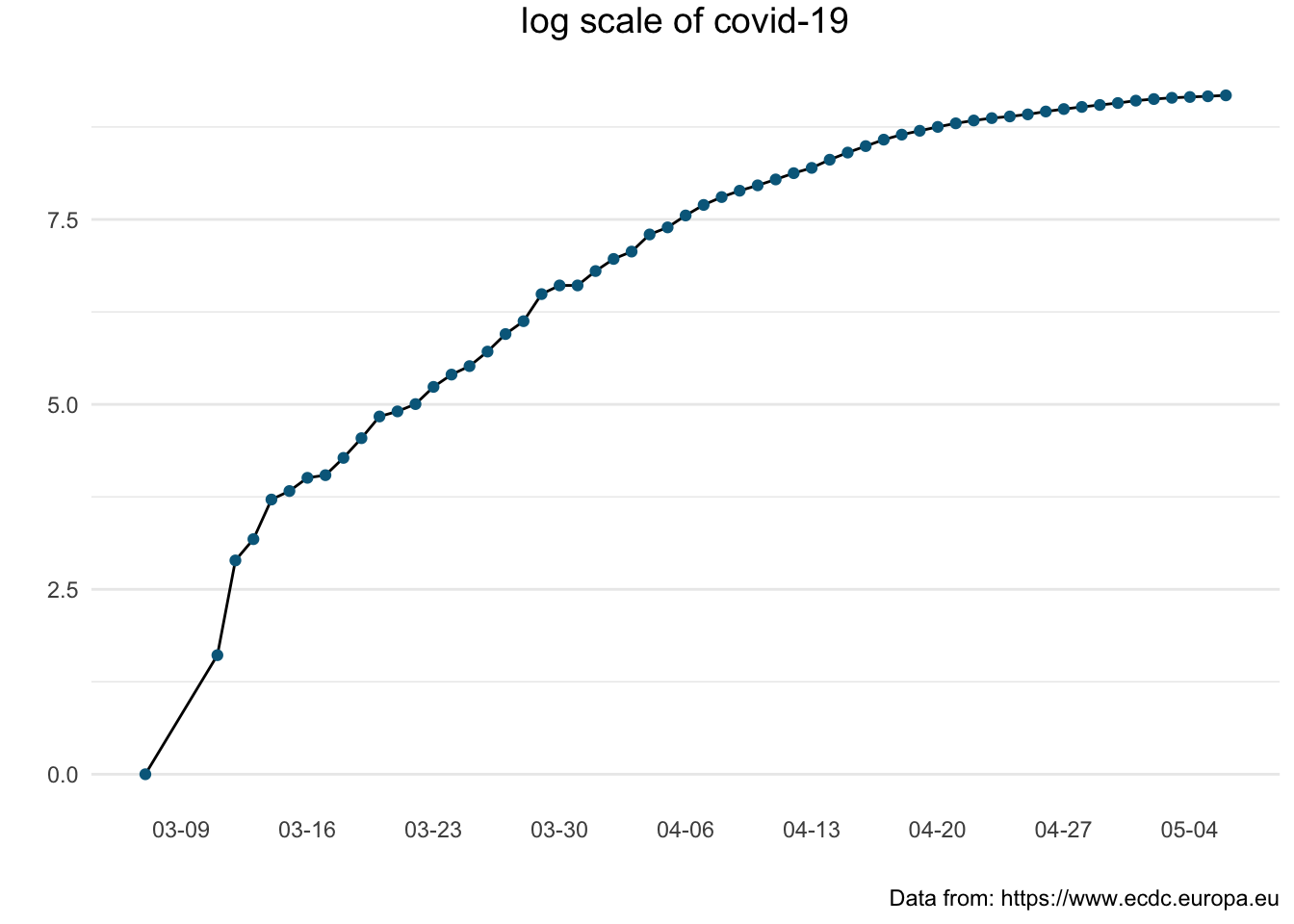
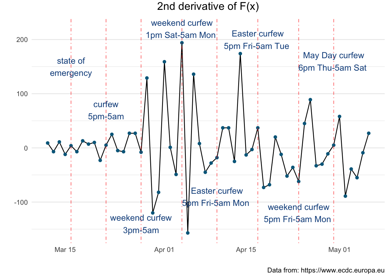
Although \(F(x)\) can show the volume of epidemic it does not tell us directly about the changes in the acceleration of infections spread. This information can be provided by the derivatives of the \(F(x)\). The first derivative \(F^{’}(x)\) corresponds to the information of the number of the new cases detected every day and the second derivative \(F^{’’}(x)\) provides the information about the acceleration of the epidemic. \(F^{’’}(x) \approx 0\) indicates the state of stagnation, while \(F^{’’}(x) < 0\) indicate deceleration and of course any \(F^{’’}(x) > 0\) acceleration.
The plots below illustrate dynamic changes based on the \(F(x)\).

The following graph presents the cumulative number of covid-19 cases using a logarithmic scale to emphasise the rate of change in a way that a linear scale does not.

The following figure enables us to observe the change to the acceleration in relaion to the governmental measurments.
We are interested to see the difference of pandemic in the ex YU region.
-1.png)
On the log scale everything becomes linear and it makes a comparison of \(F(x)\) between the countries easier to observe.
_exYU-1.png)
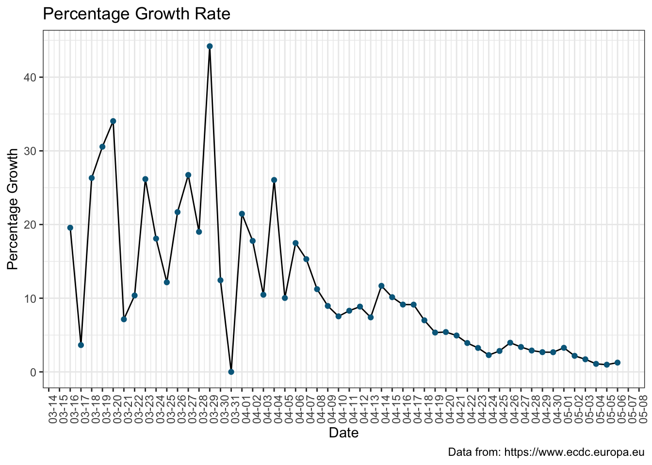
Growth Rate
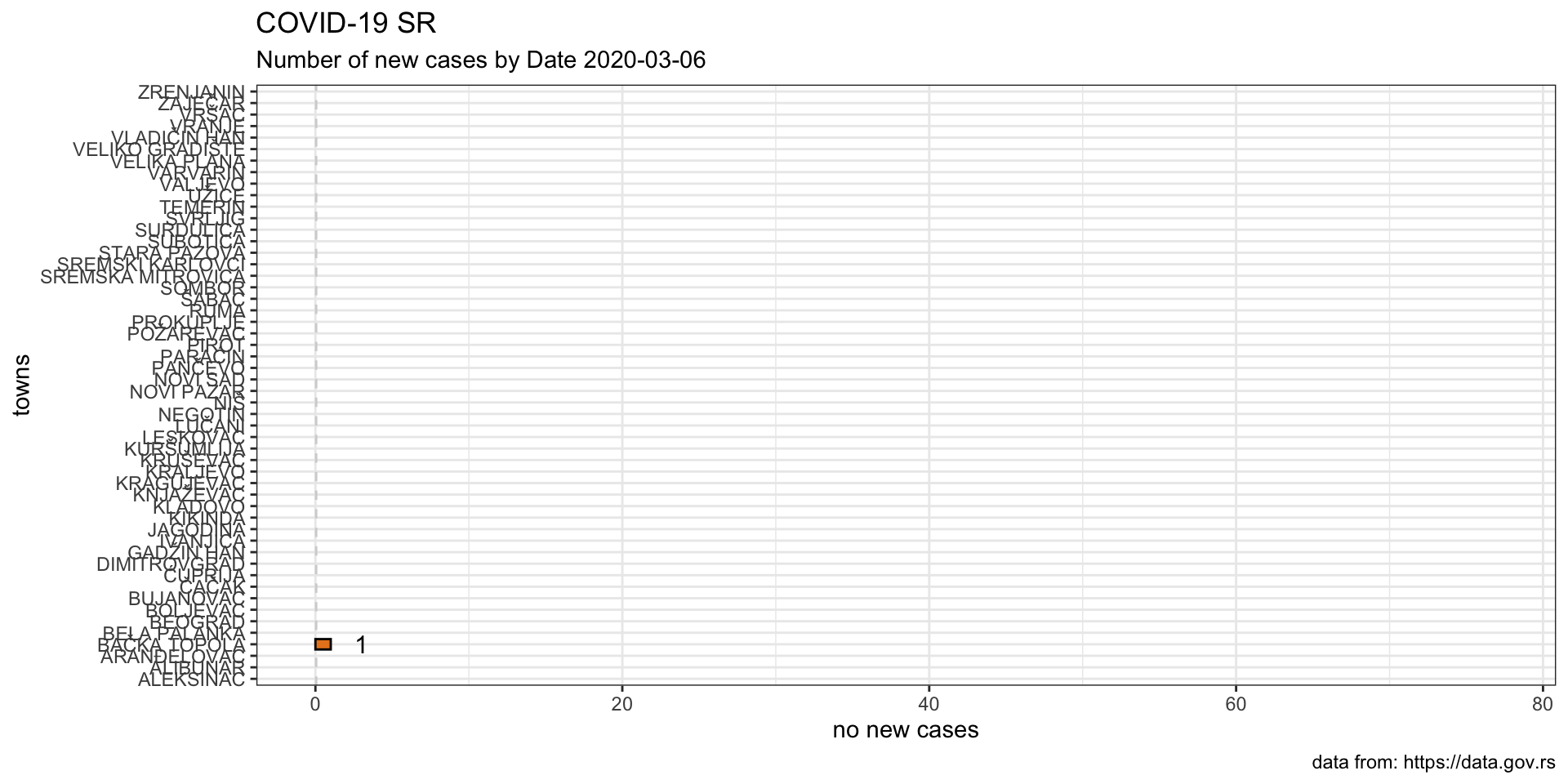
The number of registered cases at the beginning of the monitoring for covid-19 in Serbia was very small, starting from 1 on 06-March-202 and increasing by a few in the first week, reflecting in the high growth rate for those days. For example, from the first case reported on 6th March to the fourth on 9th March there is a difference of three, which gives 300% growth rate. For that reason the following graph includes growth rate figures starting from 15-March.
The data used for the following part of the analysis is sourced from the Portal of Open Data of Republic of Serbia. This data has not been updated since March 29th.
Mapping the Cases
Total Number of Cases by Day

Growth Rate of New Cases Day by Day
New Daily Cases
Animation
Table
The following table shows the number of new cases for each day in each town. You can use the text box in the top right corner to fillter the table by town.
Total Number of Cases
Animation
Table
Table below shows cumulative number of cases for each day and each town. Use the top right handside textbox to filter the table by town.
http://covid19sr.rbind.io website is built with ♥️ in .
© 2020 Tatjana Kecojevic