Principles of Visualisation
Designed to enable: exploration, discovery, communication
Graphical methods are commonly used for exploratory data analysis. Boxplots, scatterplot matrices, nonparametric smoothers and tree diagrams are just some of the most used graphical tools for data exploration. This part of the course will provide practical recommendations for choosing the best chart or graph type for creating good and clear graphics that will serve the purpose of communicating the key information:
- to the intended audience and for publication
- to help readers answer the questions your graphic is showing
- to understand it easily without getting bewildered
Graphical Forms::Encoding
Good and clear graphics rely most of all on reliable data. Thus, the first principle of an effective visualisation is that it represents reliable information. The type of information that needs to be communicated and displayed will direct the choice of the most appropriate type of data encoding to make relevant patterns become noticeable. It is therefore important to understand the problem you wish to communicate and the type of data you need for its communication from the statistical perspective, ie. is it measured, categorical (ordinal or nominal), time (temporal dimension) or geographical location (spatial dimensions) in case of spatiotemporal data?
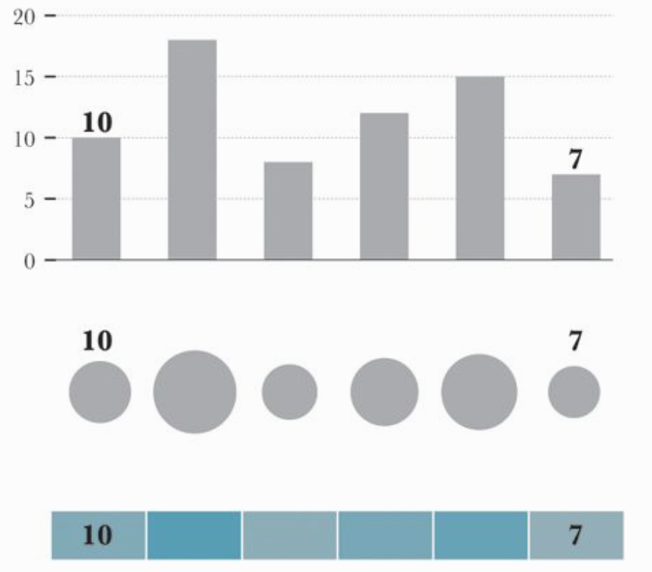
Visual encoding of a data set depends on the number and characteristics of the available attributes ie. variables and on the analytical problem in question. Alberto Cairo in his blog The Functional Art provides an effective list of the graphic forms used to encode data depending on the function of the display. The figure shows ranking of the elementary perception task according to how well they can be perceived based on the ground breaking work of Cleveland and McGill published in the paper of JASA while working in the famous AT&T Bell Labs.
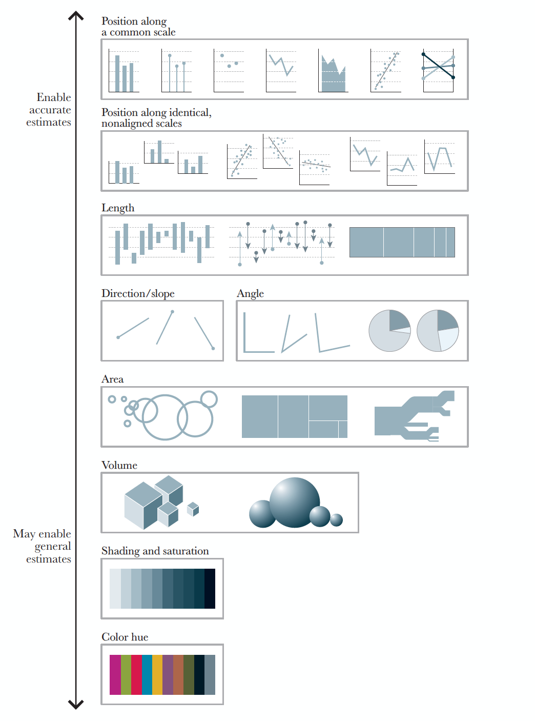
The above figure illustrates the order in which graphical forms could be placed based on the accuracy of the conclusions which readers can draw about the given data from them. If, for example, the goal of the graphic is to facilitate precise comparisons, Alberto in his book The Functional Art provides an effective illustration of superiorities between possible choices of the graphical forms that could be used.
There is not a specific methodology that is developed for choosing the most appropriate ways of encoding data. You never know if a visual form will work until you give it a try. It mostly depends on what attributes you are using in order to reveal that special something from the data. However, there are some useful guidelines made by a few authors which I would recommend that you check:
- The Data Visualisation Catalogue by Severino Ribecca
- Chart Chooser by Depict Data Studio and
- Visual Vocabulary by by the Financial Times Visual Journalism Team
as a starting bench mark when creating a graph.
Often, the graphical display of the information created for answering a specific question will invite further exploration, which is why it is important to present them in a clear and truthful manner. We should not forget that the sole purpose of data analysis, thus visualisation, is to inform and to improve knowledge. So yes, we should consider very carefully the aesthetic appeal and design of the graph we create that could effectively engage with the audience, but should do so by focusing above all on the accuracy, depth and clarity of the information it is conveying.
Identify encoding
Let us play the game ‘Identify encoding!’. Converse with each other and make a list of graphical forms and the type of encodings used in each of the following visualisation:
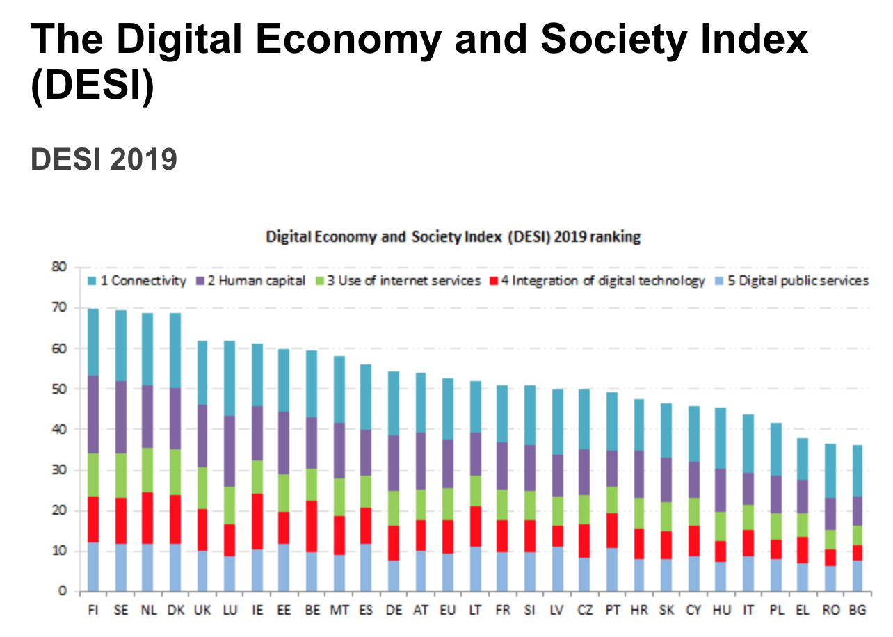
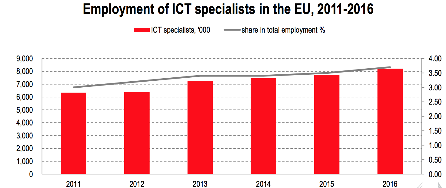
1) Visualisation: DESI
2) Visualisation: DESI Report 2019 - Human Capital
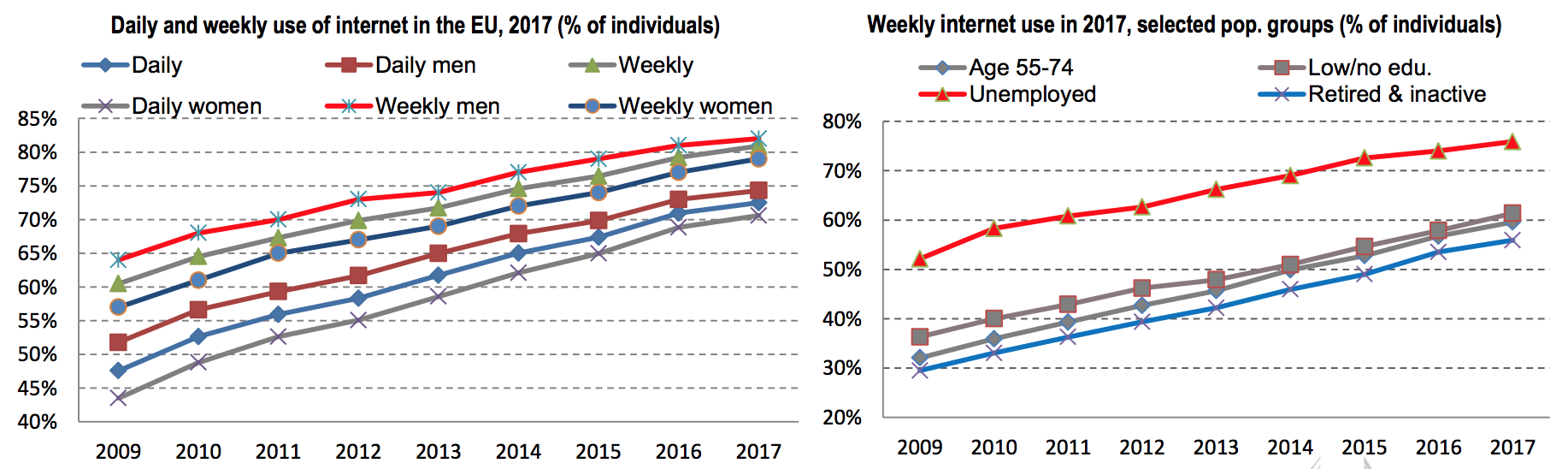
3) Visualisation: DESI Report 2019 - Human Capital
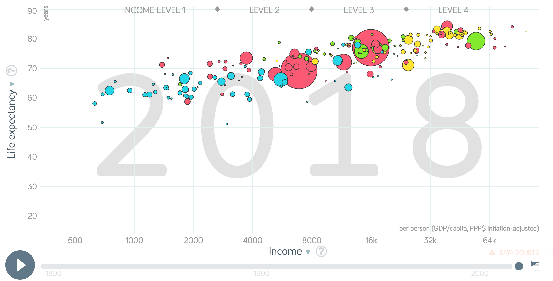
4) Click on Visualisation: Gapminder Bubble Chart
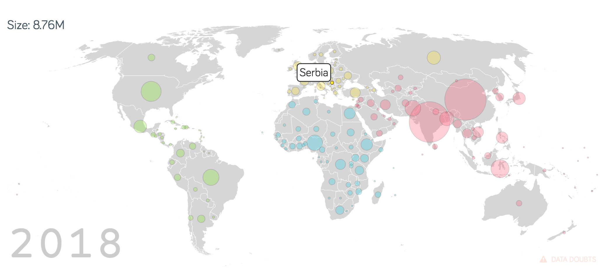
5) Click on Visualisation: Gapminder World Population
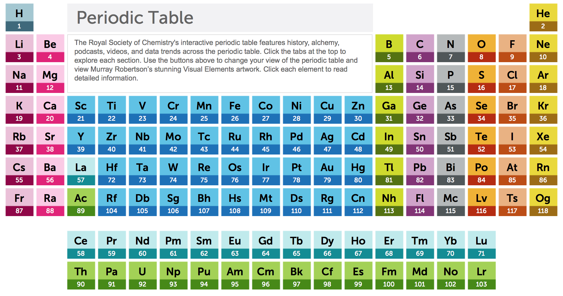
6) Click on Visualisation: Periodic Table
Click on this Visualisation too: A Periodic Table of visualisation methods
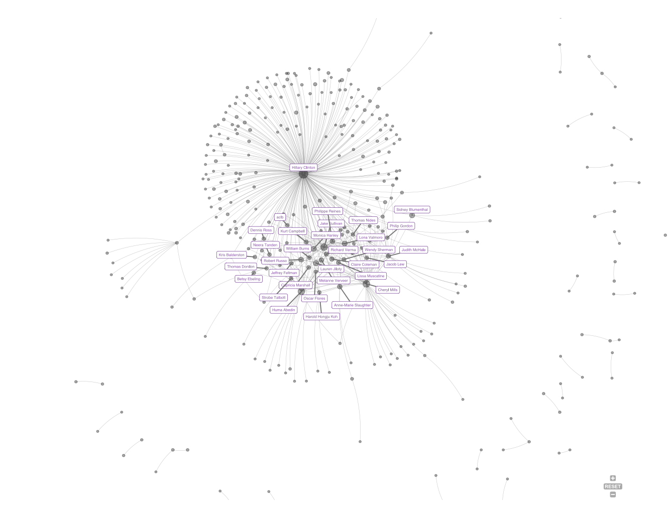
7) Click on Visualisation: Clinton Email Network
The Complexity: effective visual design
The most important thing to remember when creating a graph is to present data clearly and truthfully. The choice of scale on the chart should show the differences in the data and communicate the range of values accurately. Any statistical summary displayed on the chart should be presented clearly with the source of information and statistics used to calculate the more complex figures.
Here are some most obvious issues you need to pay attention to when designing an effective graph:
1) Choose a scale for your charts that strikes a balance between demonstrating trends clearly and conveying the scale of the original dataset. The chart does not need to begin at 0 in order to establish a meaningful baseline if another logical starting point exists. Dual-Scaled Axes in Graphs
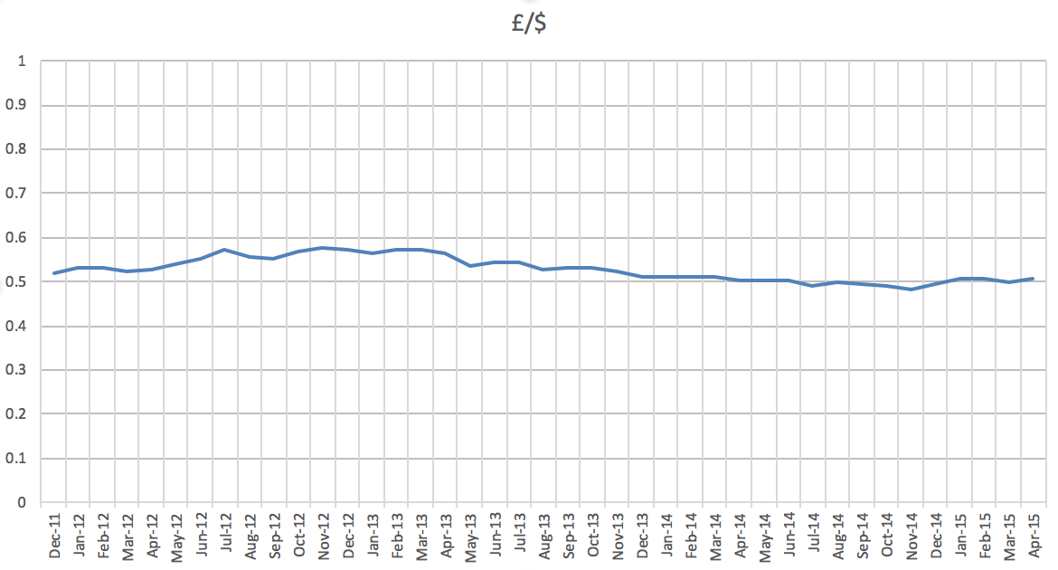
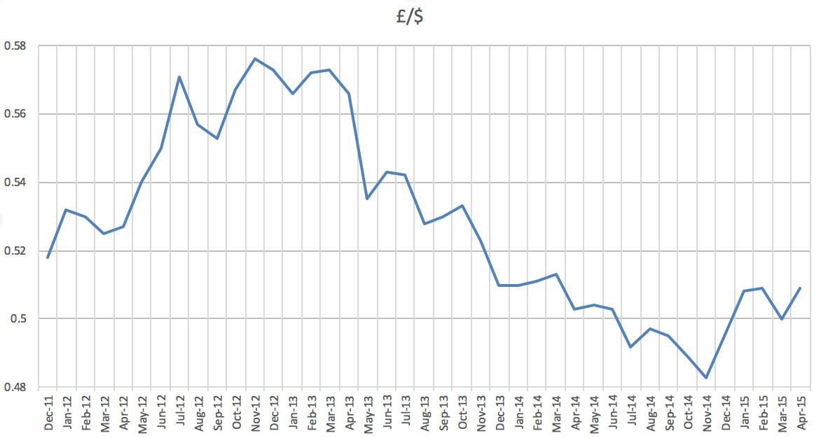
The choice of scale should provide greater accuracy for the reader about the information displayed on the chart.
Have a look at What to consider when creating a line chart blog post by Lisa Charlotte Rost, where you will also find links to some more interesting posts on this topic.
2) Emphasise what’s important: Identify the key information you are trying to communicate and think of the most effective format to do so, as graphs can help you to express complex data in a simple format. Displaying an important item in a different colour is an easy way to draw attention to a point-making value.
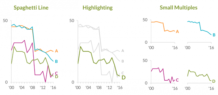
Sometimes it might be effective to pull the key information from a chart into separate graphs and to present them in parallel.
Keep in mind that the information from the visual display should not be confusing.
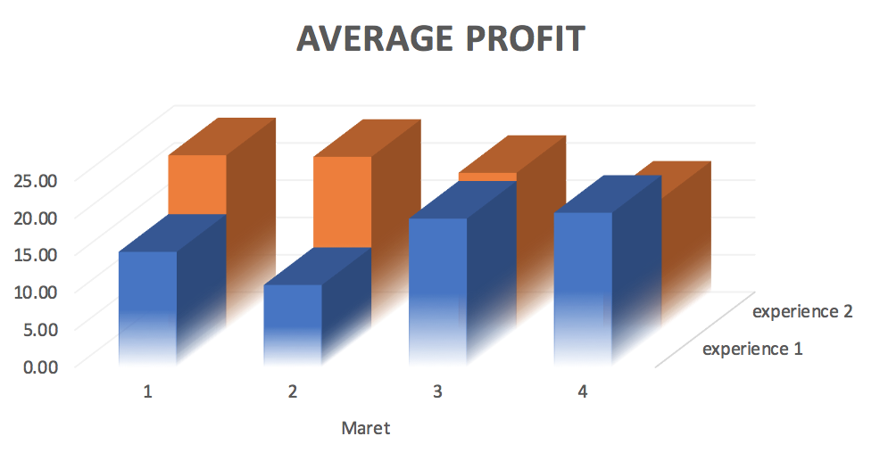
3) Declutter the chart – keep it simple as effective visualisations allow the data to tell the story. Graphs would not look better by piling on the information and bombarding us with fancy ‘viz’ skills. Effective data visualisation is a delicate balancing act between form and function. Keep the focus on the important points by reducing unnecessary visual stimuli.
Integrate text with the graphs only if necessary to help better convey information displayed through the graph.
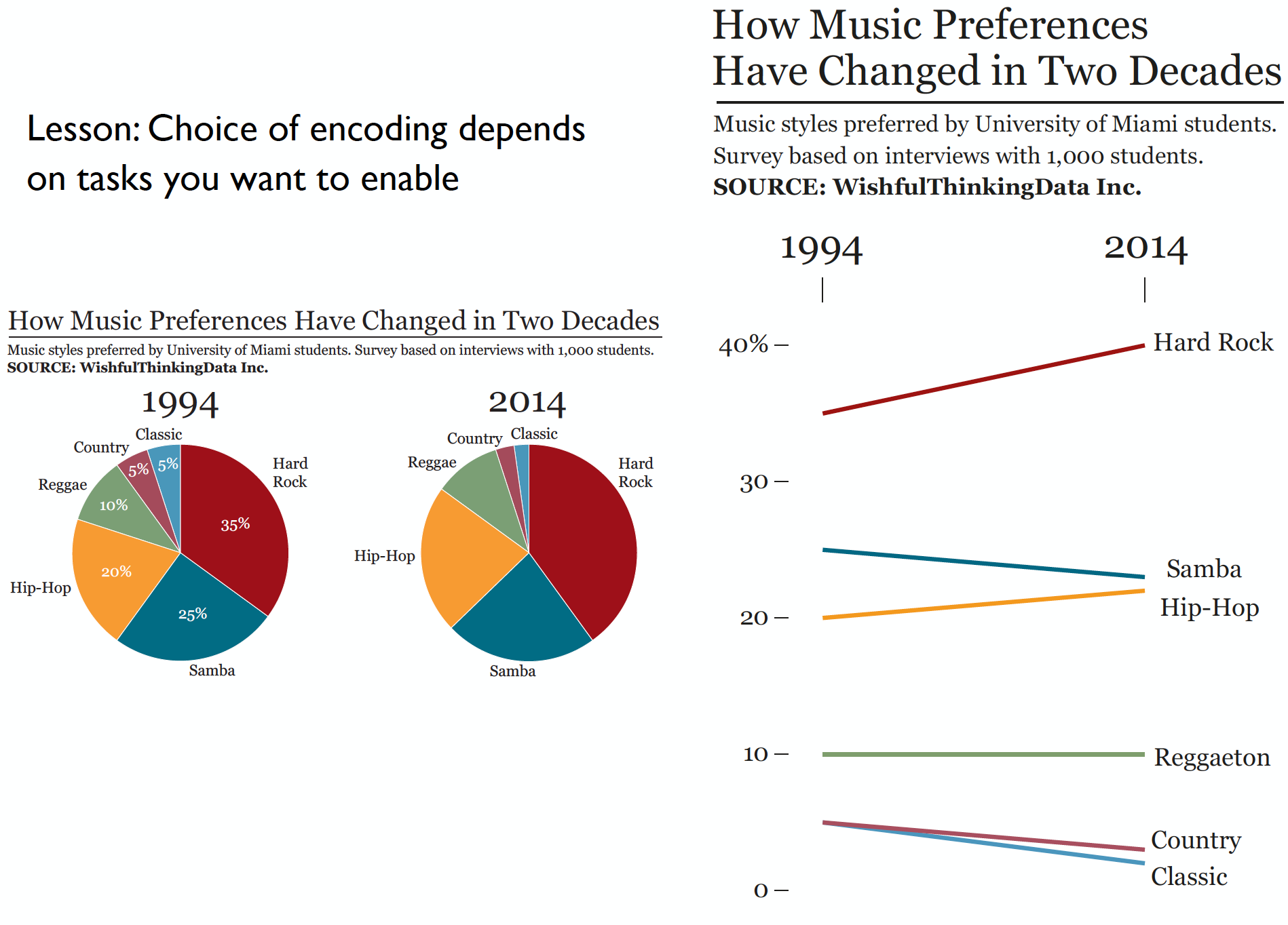
In this presentation Alberto Cairo illustrates the importance of a good choice of the format used to visually explain the main story: “How Music Preferences Have Changed in Two Decades”.
When creating a data visualisation, think about the specific information that you want your data to convey, or the outcome that you want to achieve. Keep it simple and remove any unnecessary elements that could convolute your central point. Bombarding an audience with too much data is likely to leave them doubtful and confused.
Going beyond the obvious
When creating a graphical display, focus on best practices and explore your own personal style. Build a foundation of exploring and summarising a set of numbers and identifying the key feature within the data that will help you in presenting your visual data story.
Dual Axis Charts
There is a belief that charts with two different y-axes make it hard for most people to read and to make the right conclusions about two data sets. Having a secondary y-axis often creates confusion as it is not clear which data to read against which axis. The main danger of dual axis charts is that they’re not intuitive. There are many people who are opposed to them as they often create confusion and assume correlation when there is none. Stephen Few however, has written a well-argued paper in which he carefully presents the issues one needs to take into consideration when wanting to use them. You need to judge for yourself if you are going to be a fan or not of dual y-axis charts. It should certainly depend on your judgment of its suitability for conveying your graphical story telling as with any other graphical format.
Interactive Charts
Interactivity allows the viewer to engage with data in ways that are impossible by static graphs. One of the key benefits of interactive data visualisations is their flexibility in allowing further manipulation and exploration of the data used. By enabling concentrated focus using the ‘zoom in’ facility, it makes discovery of the seemingly small facts in a big story easy and engaging, as users are invited to pose additional questions and come up with new findings. Interactive graphical story telling is a rich and powerful tool for displaying data features as it enables viewers to dive into the data story as much or as little as they wish, depending on their level of interest.
Graphical Displays in R: where to start?
R is a great tool for data visualisation not just for people who want to develop understanding about their data using graphs, but anyone who needs to produce high-quality and effective graphics to enhance their reports, web pages, or other documents.
Take a look at The R Graph Gallery that provides an extensive collection of charts made in R together with the code.
There are several classic books on drawing graphics in R, such as:
- ggplot2 [Wickham, 2009]
- Lattice [Sarkar, 2008] and
- R Graphics [Murrell, 2011].
If you would like to get more serious and systematic in your learning about graphical data analysis with R, a book by Antony Unwin, Graphical Data Analysis with R, is a great place to start. The R code for every graphic and analysis in the book is available from the book’s website.
Data Visualisation with R by Rob Kabacoff is another good book about graphical displays in R. It gives a systematic overview for creating graphical displays in R starting with a brief introduction to R, followed by a comprehensive list of graphical forms commonly used in statistical modelling, geospatial mapping and finishing with interactive plots.
Back in 2012 there was a very engaging academic discussion between Andrew Gelman, Anthony Unwin, Stephen Few, Paul Murrell, Hadley Wickham and Robert Kosara about visualisation and infographics. Robert compiles all the discussion posts in this blog post that makes riveting reading.
Practise! Gaining experience in interpreting graphics and drawing your own data displays is the most effective way of becoming a data wiz.
YOUR TURN 👇
1) Go to the portals with open data (global: gapminder, national: office of national statistics, or local) and see if you can find data that is interesting for you to explore. Write down what interesting features you are expecting to see and suggest types of visualisations that could be used to illustrate them.
© 2020 Sister Analyst